To use Quick Charting effectively its important to configure it to each providers individual needs.
Each Provider can customise the Quick Chart to optimise its effectiveness as a productivity tool.
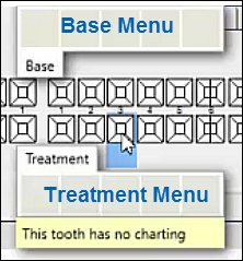
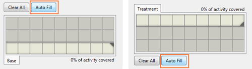
The Quick Chart Menu template has a top Base menu and bottom Treatment menu:
These need to be configured from the Configure Quick Chart Menu window, as described in general in this topic, and in detail in the sub-topics below.
To set up the Quick Chart from the Configure Quick Chart Menu window
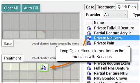
In the Quick Chart Menu, right-click > Configure:
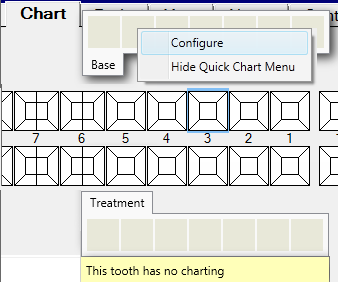
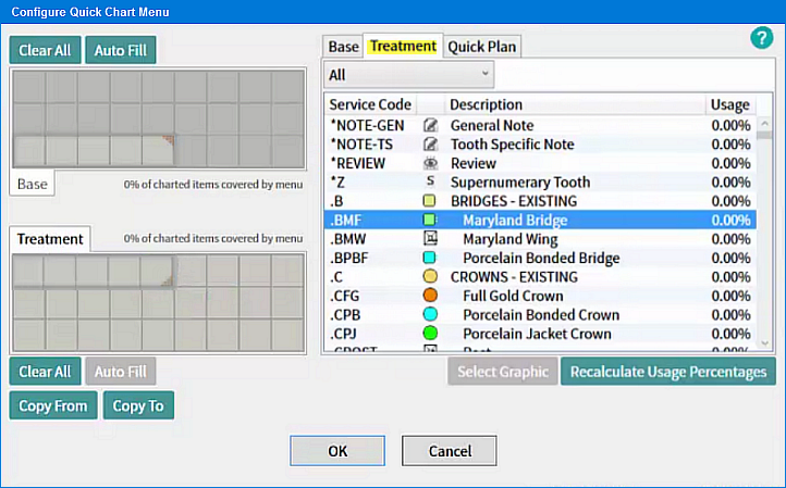
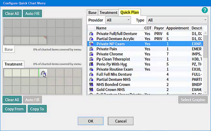
The Configure Quick Chart Menu window opens by default at the Base tab:
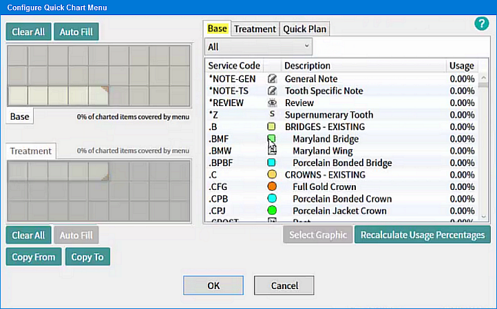
The Base and Treatment Menus need to be populated as follows from the three tabs' contents at right:
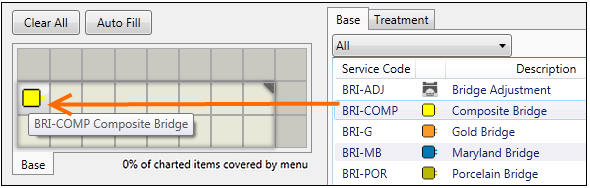
Simply drag-and-drop Services and Quick Plans onto the cells of the Quick Chart Menu.
For example:
Resize the Quick Chart Menu as required by dragging from the right corner:
Besides the Base tab for populating the Base Menu, use the Treatment tab to populate Services on the Treatment Menu, and the Quick Plan tab to populate Quick Plans on the Treatment Menu:
The Treatment tab, for populating the Treatment menu with Services:
The Quick Plans tab, for populating the Treatment menu:
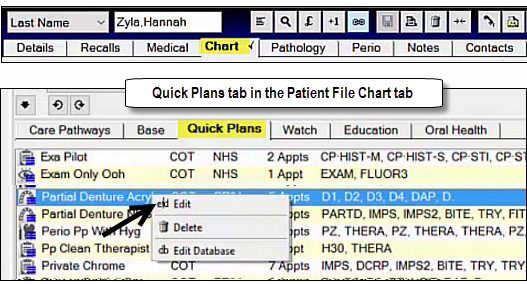
To configure Quick Plans for use on the Quick Chart Menu
In the Quick Plans tab within the patient Chart tab, right-click a Quick Plan and select Edit:
The Quick Plan Wizard opens for editing:
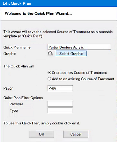
To change the graphic used in quick plans click select graphic

Choose the icon and click Ok too accept the changes.
To edit Quick Plan icons from the Configure Quick Chart Menu
Display the Quick Chart Menu.
Right-click it and select Configure.
In the Configure Quick Chart Menu, select the Quick Plan tab:Select a Quick Plan.
Click the Select Graphic button to open the Select Graphic window.
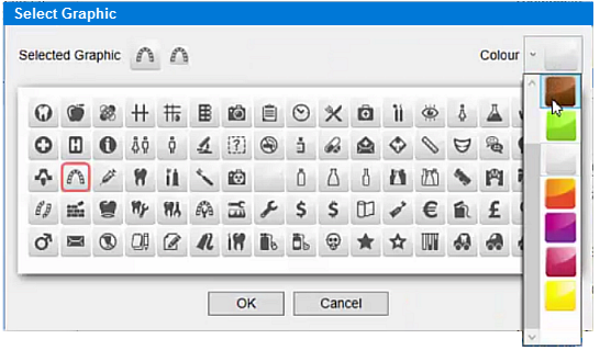
This functions in the same way as the Services graphic window, but because this is a Quick Plan, no matter which graphic you choose, EXACT will overlay it with the standard Quick Plan icon: "Quick Plan identifier"
 as an overlay. For example:
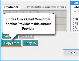
Copying Quick Chart Menus Between Providers
To copy Quick Chart Menus between Providers
In the Configure Quick Chart Menu window, fully configure a Quick Chart Menu for Provider A.
Click the Copy To button at bottom left, and select Providers B, C, D... to whom to copy it to:
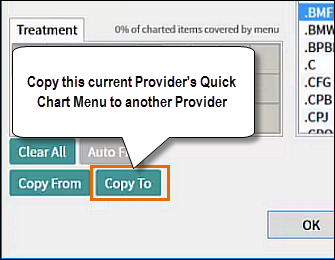
If at any point you are configuring a Provider Quick Chart Menu, click the Copy From button, and select an pre-configured Provider from whom, to copy from:
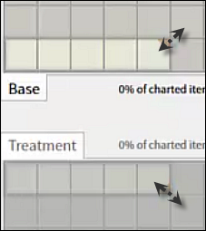
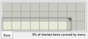
To resize the Quick Chart Menu grid
In the configuration screen, drag the Base and Treatment menu grids from the top right corner to resize them as you require.
For example, here the Base area is being doubled in size so that the Base menu will be able to display more service icons:
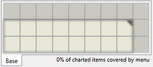
This causes the Quick Chart Base Menu to resize equivalently:
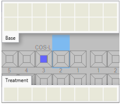
Assign Services
To manually add Services to the Quick Chart Menu
Drag services to an appropriate menu cell:
or -
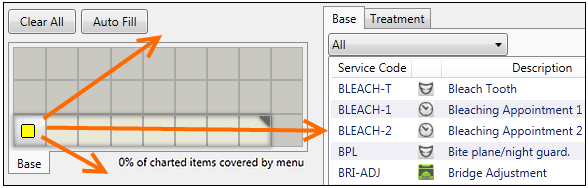
Double-click services to have them automatically populate cells as follows,
For Base menu, starting from bottom left and filling across and then upward.
For Treatment menu, starting from top left and filling across and then downward.
Note:
For purposes of populating the hover menu, EXACT identifies your most frequently used services and positions them at the top of service lists.
You can drag icons around the grid to re-position them.
If you drag a service onto an occupied square it will replace the existing service icon.
If you add a service to the grid when it is already in the grid, the existing icon will disappear, leaving a blank.
You can place services that do not have icons, but they will show up with the 'not set' icon.
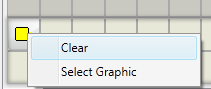
To remove services from the Quick Chart Menu
Drag the icon anywhere off the menu grid:
or -
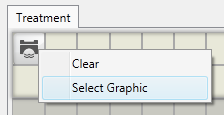
Right-click > Clear:
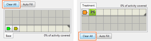
To Clear All services from the Quick Chart Menu
Click the Clear All button for the selected menu:
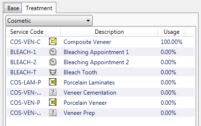
In the Treatment tab you can conveniently display services by category.
So, for example, if you are planning a cosmetic treatment, it is convenient to be able to display just the cosmetic services for loading into the Quick Chart menu:
Choose Cosmetic:
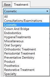
...to display:
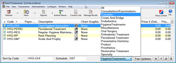
These available Treatment categories are as defined in the Service Code Categories configuration.
The same categories are then available throughout Charting. For example:
You can customise icons to better apply particular policies. For example, a popular strategy is to colour a range of services in a similar way:
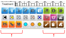
Colour categories
Because configuration is quick and easy, you can also change the colour of many default graphics "on the fly". This enables you to assign meaning to colour variations of each graphic.
Services without assigned graphics

Services that do not have a default graphic (or user selected one) appear as a grey icon with a question mark. You can customise these by both graphic and colour.
Customisation limitations:
The Select Graphic button is only available to users with security permission to edit services.
Some graphics are pre-set:
All the services with a chart graphic type have a fixed menu graphic that cannot be edited except with the colour setting.
Fillings have a standard MO shape, with the graphic scaled to fit the line height. The icon cannot be customised, and the Select Graphic button is greyed out. For example, :
To customise Treatment icons from the Quick Chart
Open the Select Graphic window by any of these means:
Right-click a Treatment icon in the left Treatment menu area and Select Graphic
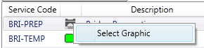
Right-click a Service icon in the Services list and Select Graphic
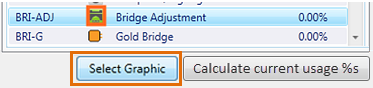
Select a Service icon in the Services list and click the Select Graphic button.
The Select Graphic window displays:
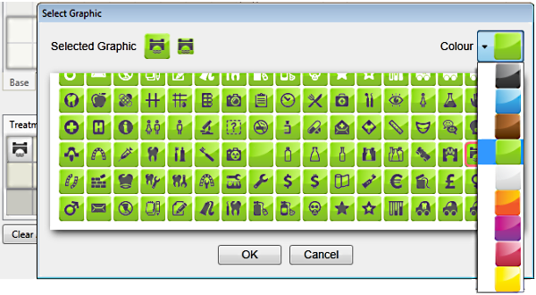
Customise by choosing a different icon or by changing the colour of the existing icon, and then select OK.
To customise Treatment icons from Configure > Services > Edit Service
From the main EXACT interface, select Configure > Services
When the list of services displays, double-click the service for which you want to edit the icon.
The Edit Service Item screen displays.
Click the Select Graphic button to display the Select Graphic window:

Choose a different icon or change the colour of the existing icon, and then select OK.
When a Provider logs in, EXACT by default reads the previous 12 months of data and calculates the percentage service usage by that Provider (which services are used the most frequently , scaled down to which are used the least frequently).
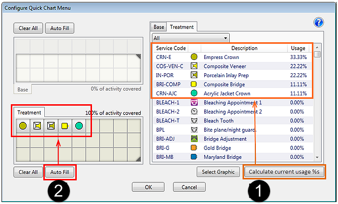
The Autofill facility enables automatic population of the most used services into both the Base (top) and Treatment (bottom) areas of the Quick Chart.
A new provider has no services usage history, and therefore by default sees only 5 blank spaces on the Quick Chart Base and Treatment menus.
Once a Provider completes and charges (or TCs) some treatment plans, EXACT is able to calculate which services this Provider has used most frequently.
To check the percentage service usage
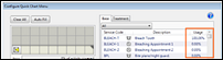
In the Configure Quick Chart Menu, user would now choose the "Recalculate List" for EXACT to check which services are used most often. Below screenshot shows a new Provider who has treated their first patient with 2 fillings (A and C). The Recalculate List button shows this now as 50% for each service. User then chooses "Auto Fill" to update these 2 services into their "Treatment" area of the QCM. Same process would be used for updating the Base tab. For practical application, the dentist would periodically go into Configure Quick Chart Menu (as needed) and choose "Recalculate List". The provider can always manually add services by double clicking or dragging them to the "rubber band" (stretch-able) QCM "grid
To Autofill the Quick Chart Menu
Autofill enables you to automatically populate the menus with the most commonly used services in the business, that are not already on the menu.
For new installations with no usage statistics:
For a completely fresh installation of EXACT, the software has no data to calculate, so will simply produce 5 empty boxes.
To customise the calculation period for autofill
Configure > Settings > quick.chart.data.monthscharted
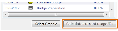
To calculate the current usage percentages before Autofill
You have the option to click the Calculate current usage %s button prior to clicking Autofill.
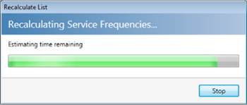
This causes EXACT to recalculate all of the lists for all users simultaneously, and may take some time.
Note how the ordering of icons in the Treatment tab below follows the percentage Usage:
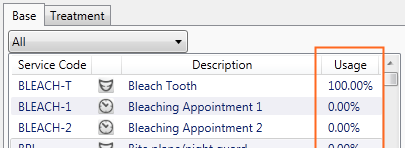
The most frequently used services display at the top of the Services List:
For convenience of adding the most appropriate services to the menu, the services list in the Configure Quick Chart Menu is sorted by most frequent usage:
How to use this list
View your most frequently used services by percentage usage.
Manually populate the Quick Chart Menu with services that are most likely to be used.
Autofill the Quick Chart Menu with services that the system calculates are most frequently used.
Manually Calculate Current Usage Percentages of the services list to refresh by most frequently used.
To calculate current usage percentages and re-sort the services list by most frequent usage
You have the option to click the Calculate Current Usage Percentages button prior to an Autofill, which will cause EXACT to recalculate all of the lists for all users simultaneously, and may take some time.
With a long list you may see a progress indicator: